Contour
Last updated
Last updated
The Contour chart is based on the polygon contour generation function. It takes a point layer and value column, and produces line and polygon output.
Features
Quantity
Notes
2
Dimension 1 = Columnar longitude Dimension 2 = Columnar latitude
1
Contour value
The Contour chart generates contour lines from raster data or from a geo point. A common example of this kind of chart shows elevation contour lines on a topographical map.
The feature flag ui/enable_contour_chart must be enabled to use the Contour chart.
To create a Contour chart, you input data in the form of longitude and latitude dimensions, and select a contour value measure, which sets a column with which to generate the contour lines. Contour charts have the following available UI settings.
Width
[1…5]
Color
Single color picker
Opacity
[0…100]
Interval
Range can be 1 .. max data range, with default of data range / 15. Max data range is the contour value (max - min)
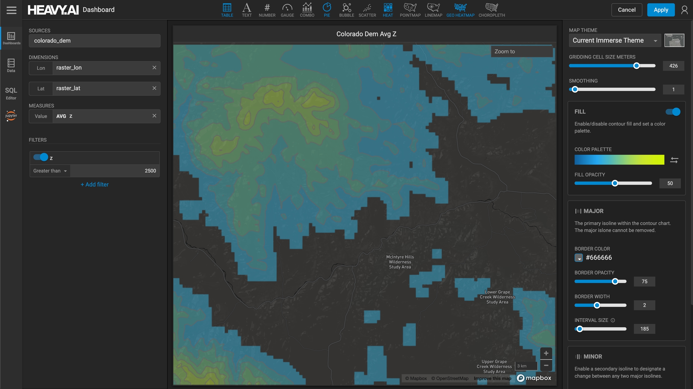
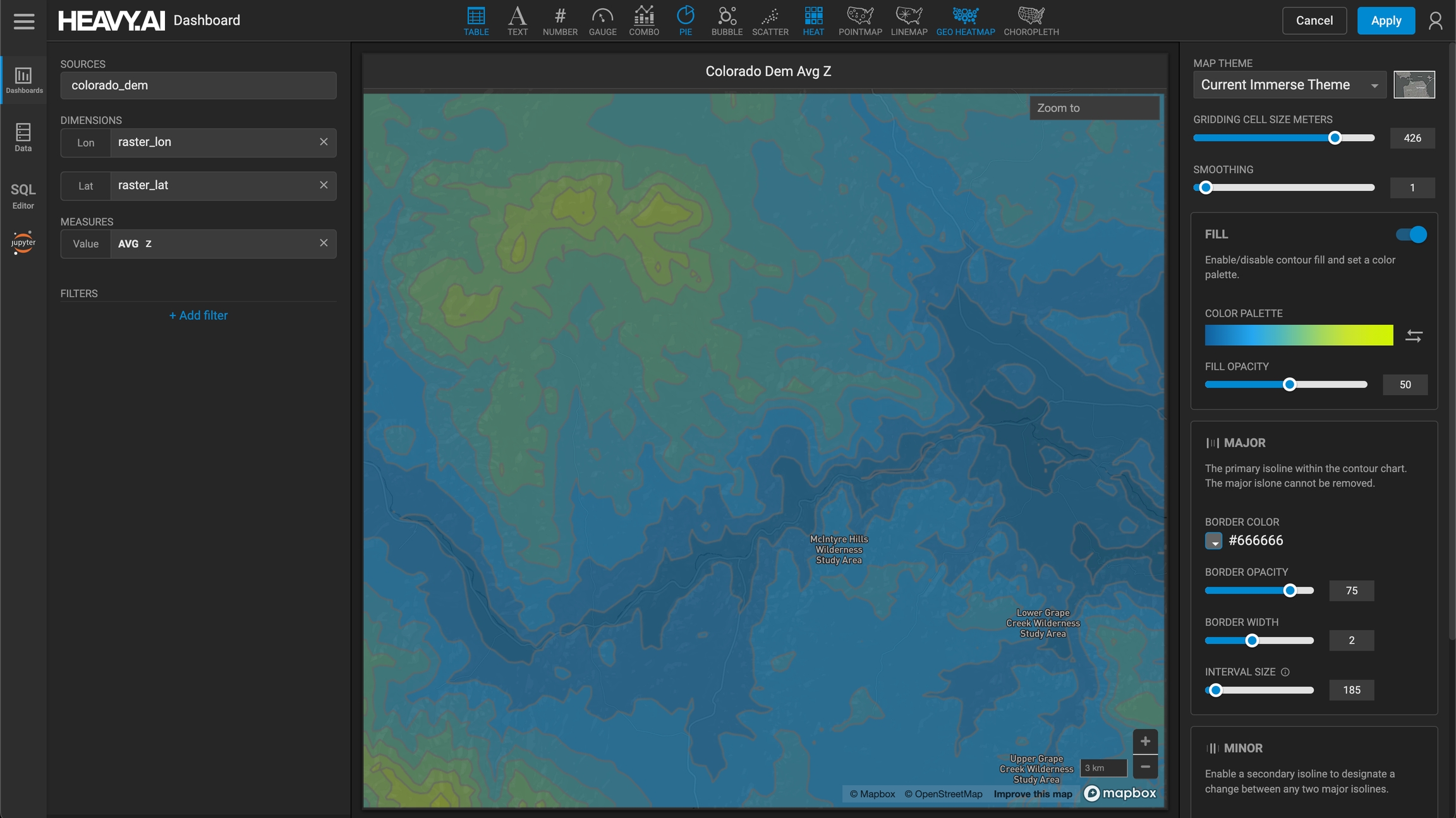
In this topographical map example, the dimensions are raster_lon and raster_lat, and the contour value measure is elevation.
Contour lines are split into two categories, major and minor. You can adjust the interval between the lines, as well as the style. Hovering over the Contour map shows the value for that particular contour.
You can toggle Contour Fill on and off to fill the areas between the contour lines with polygons. You can also select a color scale can be selected for these contour polygons.
You can apply a filter dimensions and measure values. In this example, the contour map only shows average elevation above 2500 feet (z is greater than 2500):
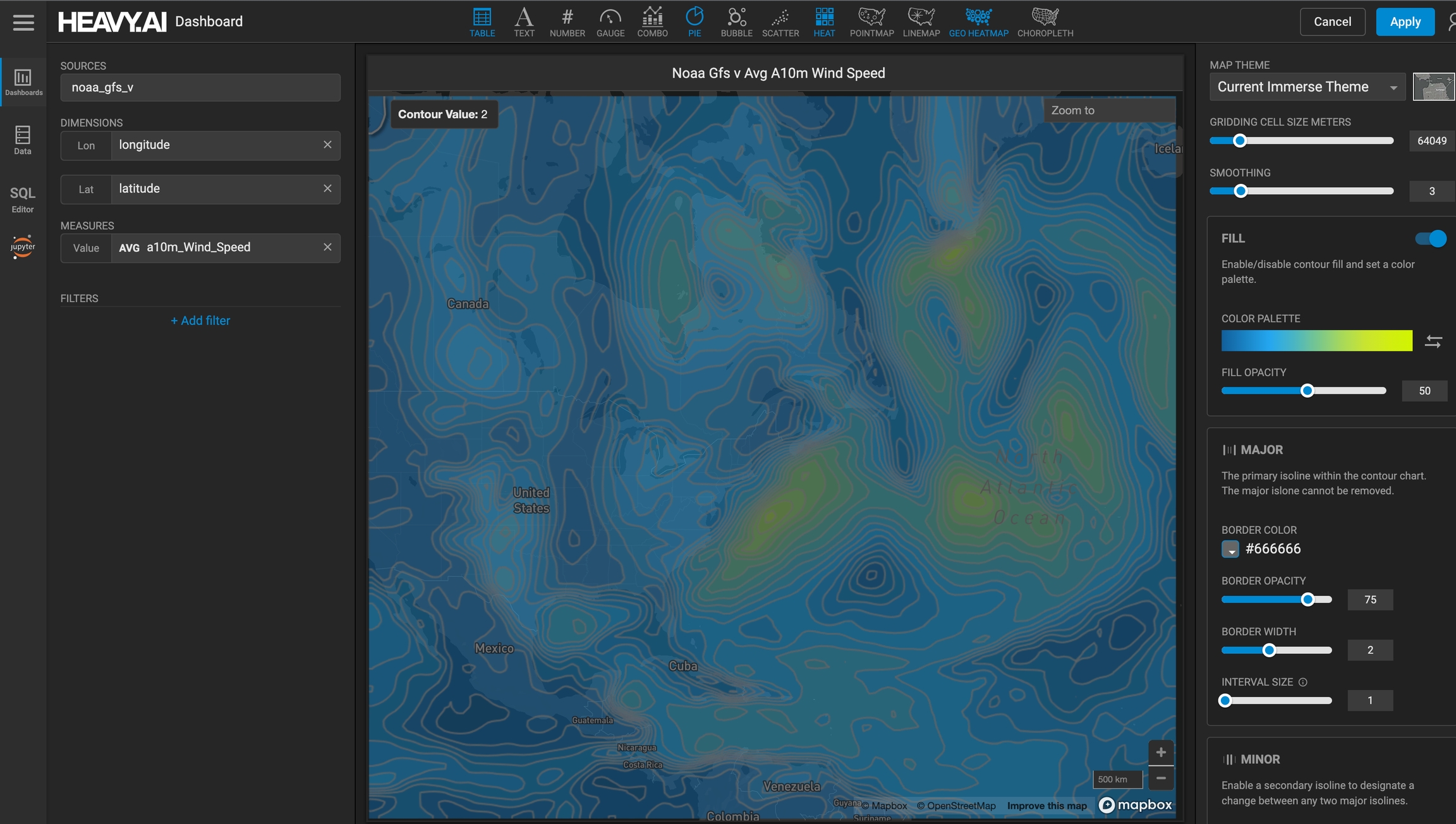
In addition to elevation on a topographical map, you can also use Contour charts for a number of other applications. For example, the following Contour chart uses NOAA data to show average wind speed in the north Atlantic Ocean.
Required
Required


