Interactive Data Exploration with Altair
The HEAVY.AI data science foundation includes the Altair visualization library. An overview of Altair from the project website:
Altair is a declarative statistical visualization library for Python, based on Vega and Vega-Lite, and the source is available on GitHub.
With Altair, you can spend more time understanding your data and its meaning. Altair’s API is simple, friendly and consistent and built on top of the powerful Vega-Lite visualization grammar. This elegant simplicity produces beautiful and effective visualizations with a minimal amount of code.
Altair and Ibis
Although Altair is typically used with smaller, local datasets, HEAVY.AI has integrated it with Ibis (and this integration itself is open-source). This combination allows interactive visualization over extremely large datasets consisting of billions of data points, all with minimal Python code.
In addition, Altair supports composable visualization, which allows for more than just local data exploration on small datasets when combined with Ibis. Because Ibis can support multiple storage backends, you can, for example, create charts that cover more than one (remote) data source at a time.
Examples
The following examples highlight the capabilities of Altair and ibis together with HEAVY.AI.
First, install ibis-vega-transform, which in turn installs Altair and Ibis.
pip install ibis-vega-transform
jupyter labextension install ibis-vega-transform
Simple Example
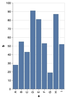
The following minimal example of Ibis and Altair together starts with a simple pandas dataframe.
import altair as alt
import ibis
import ibis_vega_transform
import pandas as pd

source = pd.DataFrame({
    'a': ['A', 'B', 'C', 'D', 'E', 'F', 'G', 'H', 'I'],
    'b': [28, 55, 43, 91, 81, 53, 19, 87, 52]
})

connection = ibis.pandas.connect({'source': source })
table = connection.table('source')

alt.Chart(table).mark_bar().encode(
    x='a',
    y='b'
)
This produces an image like this.
Adding Interactivity
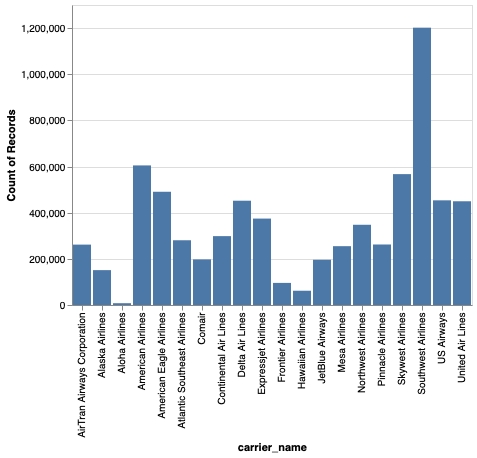
Next, let's use Altair with a more scalable Ibis backend. This example uses HeavyDB, but you can try this with other Ibis backends supported via the ibis-vega-transform project that bridges Altair to Ibis.
This example connects to a public HEAVY.AI server, but you can use any HEAVY.AI server you have access to.
conn = ibis.heavyai.connect(
    host='metis.mapd.com', user='admin', password='HyperInteractive',
    port=443, database='heavyai', protocol= 'https'
)

t = conn.table('flights_donotmodify')
Here is a chart definition using Altair (and Vega/Vega-Lite) interactivity to parametrize the chart. Unlike a static pandas dataframe shown earlier, this uses an Ibis expression.
heavyai_cli = ibis.heavyai.connect(
    host='metis.mapd.com', user='admin', password='HyperInteractive',
    port=443, database='heavyai', protocol= 'https'
)

t = conn.table('flights_donotmodify')
Next, let's create a simple Altair chart. This chart groups the list of airlines by the number of records (i.e flights) in this dataset. Doing so should produce a bar chart like the earlier example, but the difference here, is that we're connected to an HEAVY.AI backend rather than using a local pandas dataframe.
In the background, the ibis expression t[t.carrier_name]) is translated into a SQL query, and the results are rendered as a chart directly - no SQL knowledge required!
c = alt.Chart(t[t.carrier_name]).mark_bar().encode(
    x='carrier_name',
    y='count()'
)
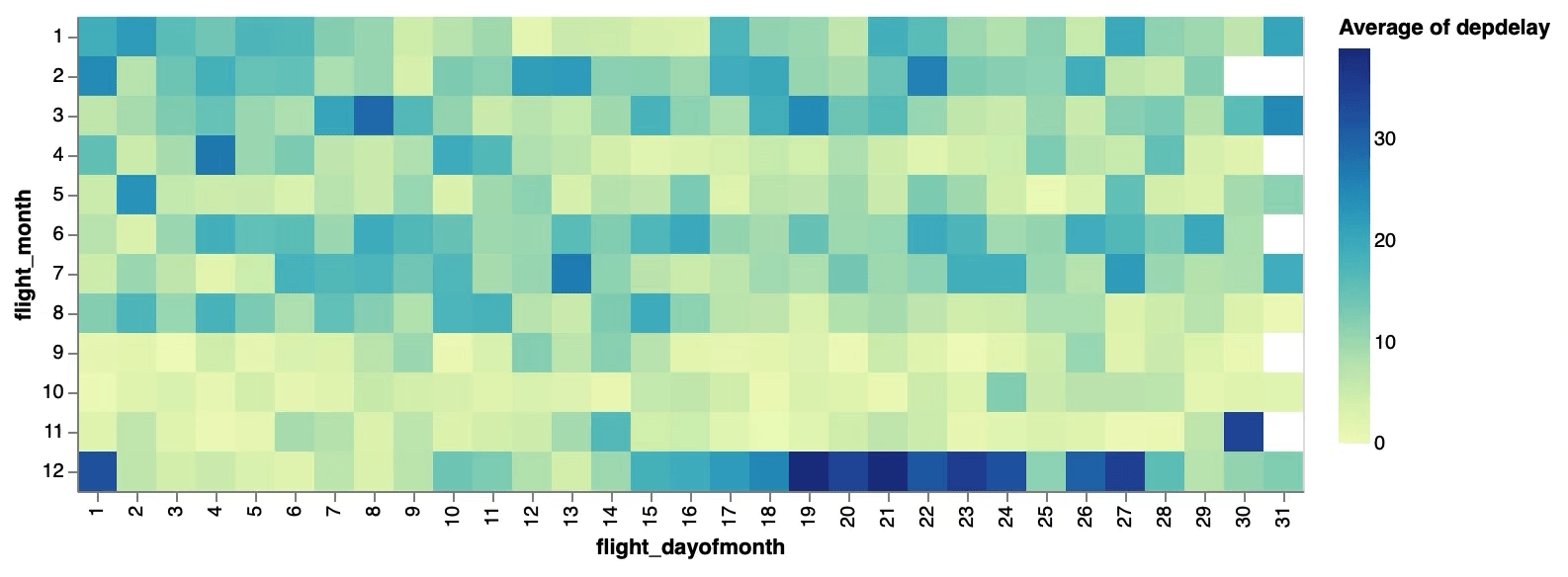
Let's create a more interesting chart beyond a simple bar chart - in this case an Altair heatmap.
delay_by_month = alt.Chart(t[t.flight_dayofmonth, t.flight_month, t.depdelay]).mark_rect().encode(
    x='flight_dayofmonth:O',
    y='flight_month:O',
    color='average(depdelay)',
    tooltip=['average(depdelay):Q']
)
delay_by_month
This should create a chart like this, where hovering over the cells shows an interactive tooltip
Adding More Interactivity
Altair provides many ways to add interactivity to charts. Actions like selection and brush filters can provide more dynamic data visualizations in Altair, that allow you to explore data in a far richer manner, beyond creating static charts.
#The next 2 lines create a selection slider to drive a parametrized Ibis expression
slider = alt.binding_range(name='Month', min=1, max=12, step=1)
select_month = alt.selection_single(fields=['flight_month'],
                                    bind=slider, init={'flight_month': 1})

#Note how this uses an Ibis expression for the chart data source
alt.Chart(t[t.flight_dayofmonth, t.depdelay, t.flight_month]).mark_line().encode(
    x='flight_dayofmonth:O',
    y='average(depdelay)'
).add_selection(
    select_month
).transform_filter(
    select_month
)
This creates an interactive chart that is parametrized by the slider. Moving the slider changes the selected month and updates the chart. Unlike working with a static, local dataset, you are now running SQL queries against HeavyDB each time the slide value changes.
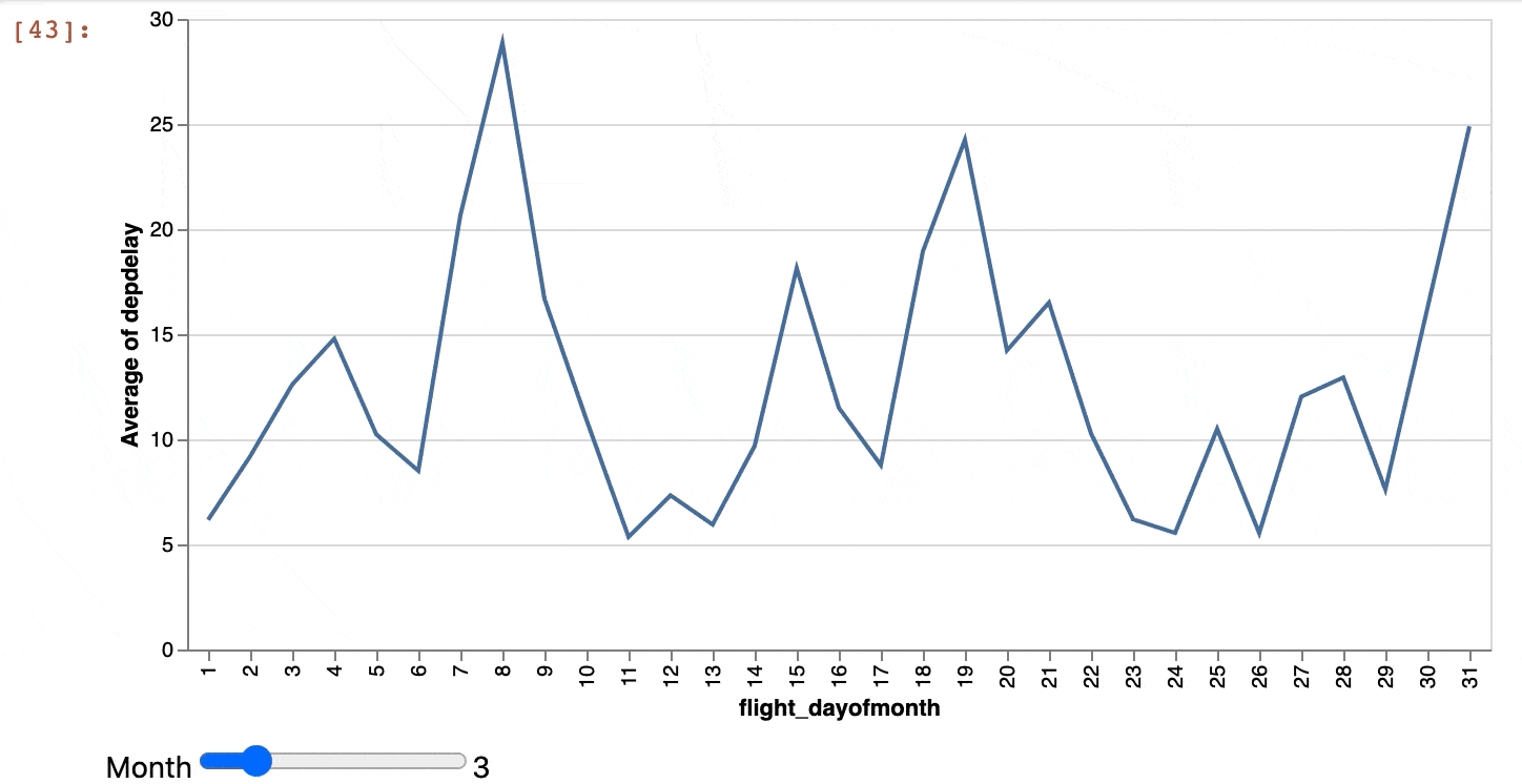
You can see this in the logs, in the final query generated:
"SELECT ""flight_dayofmonth"", avg(""depdelay"") AS average_depdelay
FROM (
  SELECT ""flight_dayofmonth"", ""depdelay"", ""flight_month""
  FROM flights_2008_7M
  WHERE ""flight_month"" = 3.0 #this is from the slider value
) t0
GROUP BY flight_dayofmonth"T
Crossfiltering
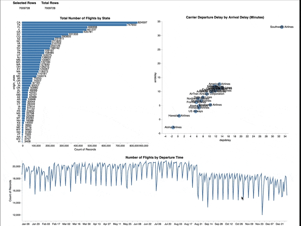
You can build sophisticated chart combinations that combine several Altair capabilities with Ibis to create a cross-filtered visualization, like in Heavy Immerse. In this example, every data source is an Ibis expression that generates SQL queries to a HEAVY.AI backend. A total of five queries are generated and executed to create the cross-filtered visualization.
states = alt.selection_multi(fields=['origin_state'])
airlines = alt.selection_multi(fields=['carrier_name'])

DEBOUNCE_MS = 50

dates = alt.selection_interval(
    fields=['dep_timestamp'],
    encodings=['x'],
    on=f'[mousedown, window:mouseup] > window:mousemove!{{0, {DEBOUNCE_MS}}}',
    translate=f'[mousedown, window:mouseup] > window:mousemove!{{0, {DEBOUNCE_MS}}}',
    zoom=False
)

HEIGHT = 750
WIDTH = 1000

count_filter = alt.Chart(
    t[t.dep_timestamp, t.depdelay, t.origin_state, t.carrier_name],
    title="Selected Rows"
).transform_filter(
    airlines
).transform_filter(
    dates
).transform_filter(
    states
).mark_text().encode(
    text='count()'
)

count_total = alt.Chart(
    t,
    title="Total Rows"
).mark_text().encode(
    text='count()'
)

flights_by_state = alt.Chart(
    t[t.origin_state, t.carrier_name, t.dep_timestamp],
    title="Total Number of Flights by State"
).transform_filter(
    airlines
).transform_filter(
    dates
).mark_bar().encode(
    x='count()',
    y=alt.Y('origin_state', sort=alt.Sort(encoding='x', order='descending')),
    color=alt.condition(states, alt.ColorValue("steelblue"), alt.ColorValue("grey"))
).add_selection(
    states
).properties(
    height= 2 * HEIGHT / 3,
    width=WIDTH / 2
) + alt.Chart(
    t[t.origin_state, t.carrier_name, t.dep_timestamp],
).transform_filter(
    airlines
).transform_filter(
    dates
).mark_text(dx=20).encode(
    x='count()',
    y=alt.Y('origin_state', sort=alt.Sort(encoding='x', order='descending')),
    text='count()'
).properties(
    height= 2 * HEIGHT / 3.25,
    width=WIDTH / 2
)

carrier_delay = alt.Chart(
    t[t.depdelay, t.arrdelay, t.carrier_name, t.origin_state, t.dep_timestamp],
    title="Carrier Departure Delay by Arrival Delay (Minutes)"
).transform_filter(
    states
).transform_filter(
    dates
).transform_aggregate(
    depdelay='mean(depdelay)',
    arrdelay='mean(arrdelay)',
    groupby=["carrier_name"]
).mark_point(filled=True, size=200).encode(
    x='depdelay',
    y='arrdelay',
    color=alt.condition(airlines, alt.ColorValue("steelblue"), alt.ColorValue("grey")),
    tooltip=['carrier_name', 'depdelay', 'arrdelay']
).add_selection(
    airlines
).properties(
    height=2 * HEIGHT / 3.25,
    width=WIDTH / 2
) + alt.Chart(
    t[t.depdelay, t.arrdelay, t.carrier_name, t.origin_state, t.dep_timestamp],
).transform_filter(
    states
).transform_filter(
    dates
).transform_aggregate(
    depdelay='mean(depdelay)',
    arrdelay='mean(arrdelay)',
    groupby=["carrier_name"]
).mark_text().encode(
    x='depdelay',
    y='arrdelay',
    text='carrier_name',
).properties(
    height=2 * HEIGHT / 3.25,
    width=WIDTH / 2
)

time = alt.Chart(
    t[t.dep_timestamp, t.depdelay, t.origin_state, t.carrier_name],
    title='Number of Flights by Departure Time'
).transform_filter(
    'datum.dep_timestamp != null'
).transform_filter(
    airlines
).transform_filter(
    states
).mark_line().encode(
    alt.X(
        'yearmonthdate(dep_timestamp):T',
    ),
    alt.Y(
        'count():Q',
        scale=alt.Scale(zero=False)
    )
).add_selection(
    dates
).properties(
    height=HEIGHT / 3,
    width=WIDTH + 50
)

(
    (count_filter | count_total) & (flights_by_state | carrier_delay) & time
).configure_axis(
    grid=False
).configure_view(
    strokeOpacity=0
).properties(padding=50)
This generates the following Altair visualization, which leverages composable charting and provides greater interactivity with enhanced selections powered by dynamic data loading via Ibis.
Geospatial Visualization
Altair and Ibis can also be used to visualize geospatial data. Altair supports multiple geospatial visualizations and can accept GeoPandas dataframes as input. Some Ibis backends, including HEAVY.AI, support spatial operations, which output to GeoPandas dataframes. By combining the two, you can create map-based visualizations.
Exploring Further
You can combine Ibis and Altair inside JupyterLab. By defining multiple Ibis backend connections with Ibis, you can create complex interactive visualizations that span multiple data sources, all without moving data into local memory. This allows greater flexibility and productivity in data exploration.