Vega Accumulator
Accumulation works by aggregating data per pixel during a backend render. Data is accumulated for every pixel for every shape rendered. Accumulation rendering is activated through color scales – scales that have colors defined for their range.
Note: Currently, only the COUNT aggregation function is supported.
This topic describes accumulation rendering and provides some implementation examples. The data source used here – a table called contributions – contains information about political donations made in the New York City area, including party affiliation, the amount of the donation, and location of the donor.
There are three accumulation modes:
Density Mode
Density accumulation performs a count aggregation by pixel. It allows you to color a pixel by normalizing the count and applying a color to it, based on a color scale. In Heavy Immerse, if you open or create a Pointmap chart, you can toggle density accumulation on and off by using the Density Gradient attribute. For more information, see Pointmap.
Note: Blend and percentage accumulation are not currently available in Heavy Immerse.
The density mode examples use the following base code:
{
"width": 714,
"height": 535,
"data": [
{
"name": "table",
"sql": "SELECT conv_4326_900913_x(lon) as x, conv_4326_900913_y(lat) as y,amount,rowid FROM contributions WHERE (conv_4326_900913_x(lon) between -8274701.640628147 and -8192178.083370286) AND (conv_4326_900913_y(lat) between 4946220.843530051 and 5008055.72186748) LIMIT 2000000",
"dbTableName": "contributions"
}
],
"scales": [
{
"name": "x",
"type": "linear",
"domain": [-8274701.640628147,-8192178.083370286],
"range": "width"
},
{
"name": "y",
"type": "linear",
"domain": [4946220.843530051,5008055.72186748],
"range": "height"
},
{
"name": "pointcolor",
"type": "linear",
"domain": [100,10000],
"range": ["blue","red"],
"clamp": true
}
],
"marks": [
{
"type": "points",
"from": {"data": "table"},
"properties": {
"x": {"scale": "x","field": "x"},
"y": {"scale": "y","field": "y"},
"fillColor": {"scale": "pointcolor","field": "amount"},
"size": {"value": 2}
}
}
]
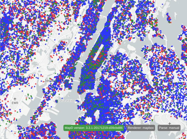
}This code generates the following image:
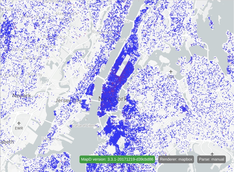
All points are rendered with a size of 2 and colored according to the contribution amount:
$100 or less is colored blue.
$10,000 or more is colored red.
Anything in between is colored somewhere between blue and red, depending on the contribution. Amounts closer to $100 are more blue, and amounts closer to $10,000 are more red.
The examples that follow adjust the pointcolor scale and show the effects of various adjustments. Any changes made to Vega code are isolated to that scale definition.
Density accumulation can be activated for any scale that takes as input a continuous domain (linear, sqrt, pow, log, and threshold scales) and outputs a color range. In the following code snippet, the density accumulator has been added to the linear pointcolor scale:
{
  "name": "pointcolor",
  "type": "linear",
  "domain": [0.0,1.0],
  "range": ["blue","red"],
  "clamp": true,
  "accumulator": "density",
  "minDensityCnt": 1,
  "maxDensityCnt": 100
}
The final color at a pixel is determined by normalizing the per-pixel aggregated counts and using that value in the scale function to calculate a color. The domains of density accumulation scales should be values between 0 and 1 inclusive, referring to the normalized values between 0 and 1. The normalization is performed according to the minDensityCnt and maxDensityCnt properties. After normalization, minDensityCnt refers to 0 and maxDensityCnt refers to 1 in the domain. In this case, 0 in the domain equates to a per-pixel count of 1, and 1 in the domain equates to a per-pixel count of 100.
minDensityCnt and maxDensityCnt are required properties. They can have explicit integer values, or they can use keywords that automatically compute statistical information about the per-pixel counts. Currently available keywords are:
minmax1stStdDev2ndStdDev-1stStdDev-2ndStdDev
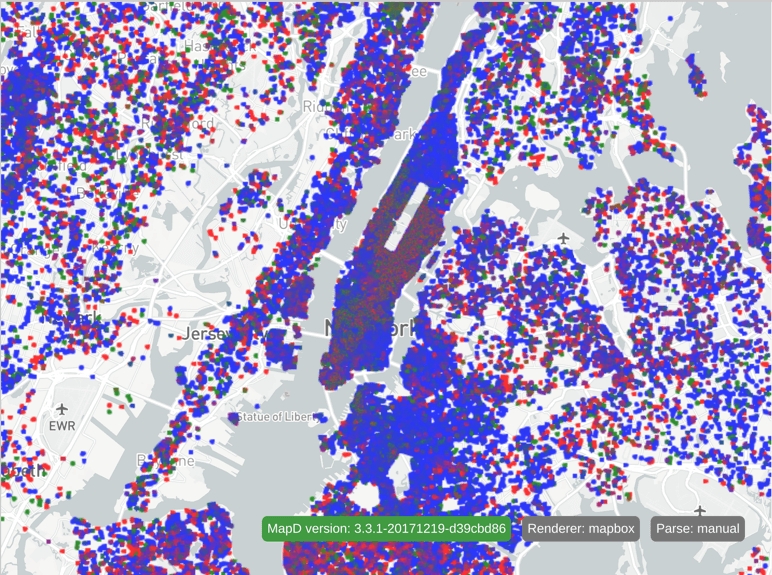
If you change the color scale to the following:
{
  "name": "pointcolor",
  "type": "linear",
  "domain": [0.01,1.0],
  "range": ["blue","red"],
  "clamp": true,
  "accumulator": "density",
  "minDensityCnt": "min",
  "maxDensityCnt": "max"
}
The minimum aggregated count of all the pixels is used as the minDensityCnt, and the maximum aggregated count used as the maxDensityCnt. This results in the following:
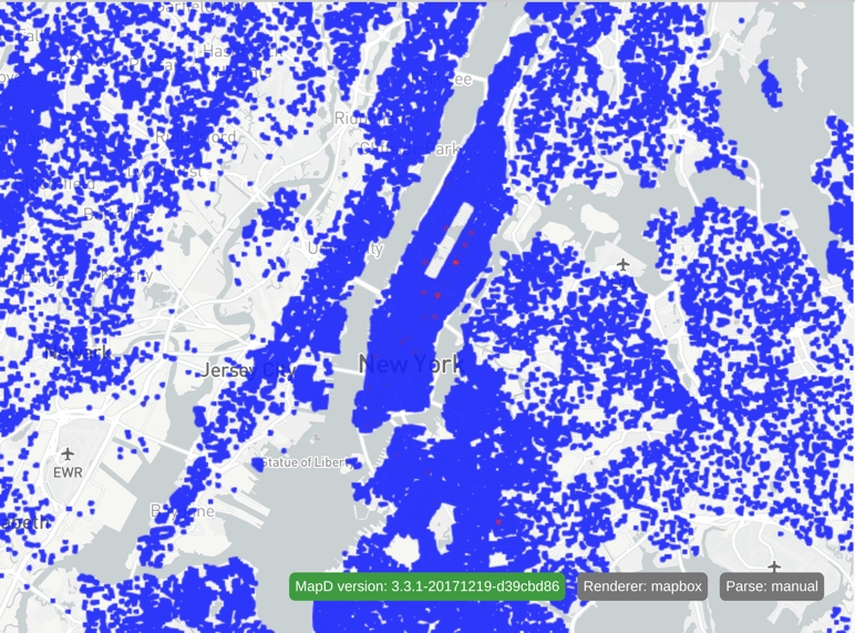
Notice that the area with the most overlapping points is in the upper east side of Manhattan.
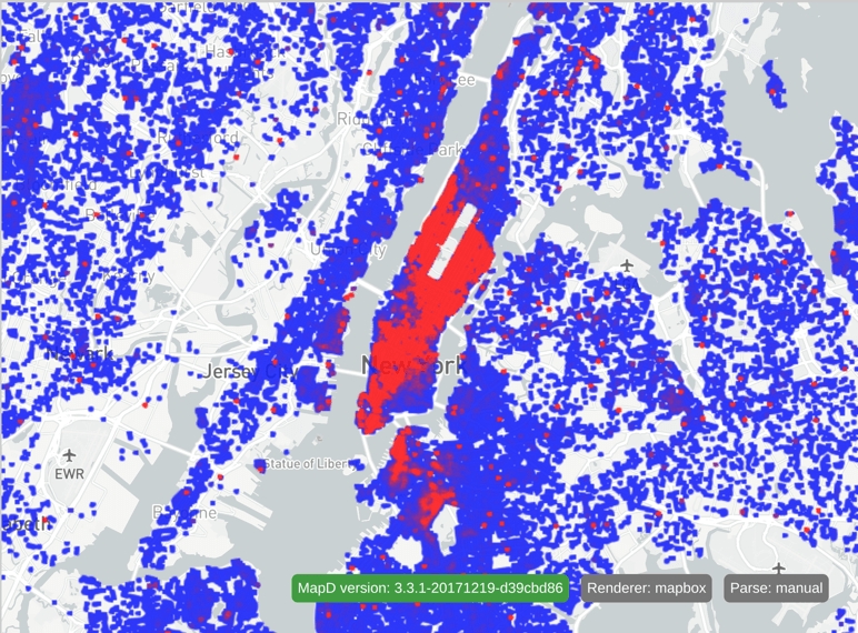
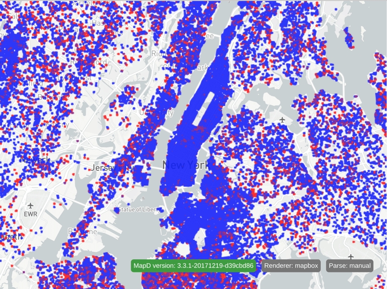
Now, use +/- 2 standard deviations for your counts:
{
  "name": "pointcolor",
  "type": "linear",
  "domain": [0.01,1.0],
  "range": ["blue","red"],
  "clamp": true,
  "accumulator": "density",
  "minDensityCnt": "-2ndStdDev",
  "maxDensityCnt": "2ndStdDev"
}
This produces the following:
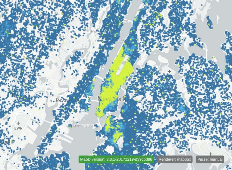
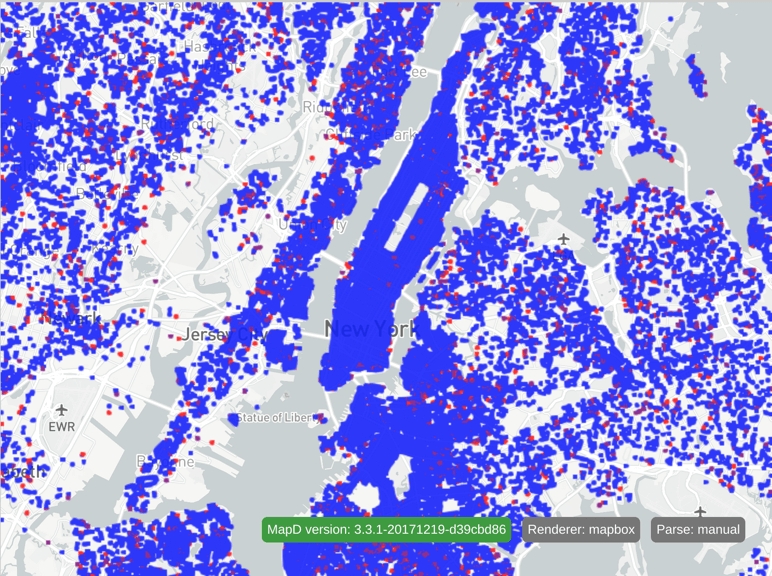
In this example, the scale is changed to a threshold scale, and the colors are adjusted to create a more interesting image:
{
  "name": "pointcolor",
  "type": "threshold",
  "domain": [0.111, 0.222, 0.333, 0.444, 0.555, 0.666, 0.777, 0.888],
  "range": ["rgba(17,95,154,1)", "rgba(25,132,197,1)", "rgba(34,167,240,1)", "rgba(72,181,196,1)", "rgba(118,198,143,1)", "rgba(166,215,91,1)", "rgba(201,229,47,1)", "rgba(208,238,17,1)", "rgba(208,244,0,1)"],
  "clamp": true,
  "accumulator": "density",
  "minDensityCnt": "-2ndStdDev",
  "maxDensityCnt": "2ndStdDev"
}
This results in:
Note: You can mix and match explicit values and keywords for minDensityCnt and maxDensityCnt. However, if your min value is greater than your max value, your image might look inverted.
Blend Mode
Blend accumulation works only with ordinal scales. This accumulation type blends the per-category colors set by an ordinal scale so that you can visualize which categories are more or less prevalent in a particular area.
The following Vega code colors the points according to the value in the recipient_party column:
{
  "width": $width,
  "height": $height,
  "data": [
        {
          "name": "table",
          "sql": "SELECT conv_4326_900913_x(lon) as x,  conv_4326_900913_y(lat) as y,recipient_party,rowid FROM contributions WHERE (conv_4326_900913_x(lon) between $minXBounds and $maxXBounds) AND (conv_4326_900913_y(lat) between $minYBounds and $maxYBounds) LIMIT 2000000"
        }
  ],
  "scales": [
        {
          "name": "x",
          "type": "linear",
          "domain": [
                $minXBounds,
                $maxXBounds
          ],
          "range": "width"
        },
        {
          "name": "y",
          "type": "linear",
          "domain": [
                $minYBounds,
                $maxYBounds
          ],
          "range": "height"
        },
        {
          "name": "pointcolor",
          "type": "ordinal",
          "domain": ["R", "D"],
          "range": ["red", "blue"],
          "default": "green"
        }
  ],
  "marks": [
        {
          "type": "points",
          "from": {
                "data": "table"
          },
          "properties": {
                "x": {
                  "scale": "x",
                  "field": "x"
                },
                "y": {
                  "scale": "y",
                  "field": "y"
                },
                "fillColor": {
                  "scale": "pointcolor",
                  "field": "recipient_party"
                },
                "size": {
                  "value": 5
                }
          }
        }
  ]
}
This results in the following chart:
Each point is colored according to recipient party. Values of R (republican) are colored red, D (democrat) are colored blue, and everything else is colored green.
To activate blend accumulation, add the "accumulator": "blend" property to an ordinal scale.
{
  "name": "pointcolor",
  "type": "ordinal",
  "domain": ["R", "D"],
  "range": ["red", "blue"],
  "default": "green",
  "accumulator": "blend"
}
This generates the following chart:
Activating blend accumulation shows you where one party is more dominant in a particular area. The COUNT aggregation is now being applied for each category, and the colors associated with each category are blended according to the final percentage of each category per pixel.
Note: Unlike in density mode, a field property is required in mark properties that reference blend accumulator scales.
Percentage Mode
Percentage (pct) mode can help you visualize how prevalent a specific category is based on a percantage. Any scale can be used in percentage mode, but the domain values must be between 0 and 1, where 0 is 0% and 1 is 100%.
Using the political donations database, you can determine where the recipient_party of “R” (republican) is more prevalent.
Here’s the color scale:
{
  "name": "pointcolor",
  "type": "threshold",
  "domain": [0.33, 0.66],
  "range": ["blue", "purple", "red"],
  "accumulator": "pct",
  "pctCategory": "R"
}
And the resulting image:
Using the threshold scale, anything colored blue is between 0%-33% republican, purple is 33%-66% republican, and red is 66%-100% republican.
pctCategory is a required property for percentage mode and can be numeric or a string. A string refers to a string value from a dictionary-encoded column.
You can modify the example to use a numeric value for pctCategory. First, modify the SQL in the Vega to select the contribution amount for each data point:
"SELECT conv_4326_900913_x(lon) as x, conv_4326_900913_y(lat) as y,amount,rowid FROM contributions WHERE (conv_4326_900913_x(lon) between -8274701.640628147 and -8192178.083370286) AND (conv_4326_900913_y(lat) between 4946220.843530051 and 5008055.72186748) LIMIT 2000000"Now use the amount as the driving field for the pct accumulator scale:
"fillColor": {"scale": "pointcolor","field": "amount"},Now, change the pct scale to the following:
{
  "name": "pointcolor",
  "type": "threshold",
  "domain": [0.33, 0.66],
  "range": ["blue", "purple", "red"],
  "accumulator": "pct",
  "pctCategory": 1000
}
This results in the following output, showing where thousand-dollar contributions are most prevalent:
You can use the pctCategoryMargin property to buffer numeric pctCategory values, so you can use a range for the numeric category.